


Should Wall Art Match Your Sofa? A Designer’s Guide to Getting It Right

Updated: 3 days ago
No — wall art does not need to match your sofa exactly. The strongest interiors usually have something more interesting going on. The artwork and sofa may share a color, mood, material, shape, or sense of balance, but they do not need to look as though they were bought as a matching set. In fact, matching too closely can make a room feel flat. The better goal is connection. The artwork should feel as though it belongs in the room while still having enough presence to stand on its own. Scale first: artwork should feel proportionate to the sofa, not lost above it. The best rooms rarely look matched. They look considered.
Start With Scale Before Colour
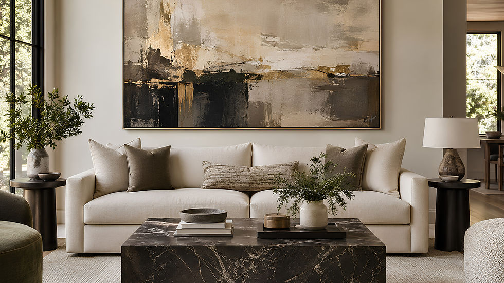
Before choosing colors, styles, or frames, check the size of the artwork. Even a beautiful painting can look wrong above a sofa if it is too small. As a general guide, artwork above a sofa should usually span around two-thirds to three-quarters of the sofa width.
| Sofa Width | Suggested Artwork Width |
|------------|-------------------------|
| 180 cm / 71 in | 110–135 cm / 43–53 in |
| 200 cm / 79 in | 120–150 cm / 47–59 in |
| 220 cm / 87 in | 135–165 cm / 53–65 in |
| 240 cm / 94 in | 145–180 cm / 57–71 in |
This does not need to be mathematically perfect. The goal is visual balance. If the artwork is too small, the sofa will overpower it, and the wall can feel unfinished. If it is too large, the area may feel heavy or crowded. The hanging height matters too. In many living rooms, leaving approximately 15–25 cm / 6–10 inches between the top of the sofa and the bottom of the artwork creates a comfortable connection between the two. One of the most common mistakes is hanging artwork too high. Above a sofa, the artwork and furniture should read as one composition rather than two separate elements.
Matching Is Not the Same as Copying
If your sofa is navy blue, your wall art does not need to be navy. If your sofa is beige, you do not need beige artwork, beige cushions, a beige rug, and beige curtains. That type of matching often removes the depth that makes a room interesting. Instead, look for one connection. It might be:
A small color repeated in the artwork
A similar mood
A frame that relates to another material in the room
A contrast that makes both the art and sofa look stronger
Shapes that balance one another
Think of the sofa as one voice in the room. The artwork can echo it, answer it, or contrast with it. All three approaches can work.
Use Colour as a Thread, Not a Rule

Color is often the easiest way to connect art with furniture, but the connection does not have to be obvious. A useful approach is to pick up one secondary color from the seating area rather than copying the main sofa color. That color might come from a cushion, rug, throw, timber finish, metal detail, or nearby object. For example:
A forest green sofa can work beautifully with artwork containing cream, black, ochre, blush, or pale blue.
A tan leather sofa can pair with charcoal, rust, ivory, olive, or deep red.
A pale grey sofa often benefits from warmer artwork in terracotta, camel, muted gold, or soft pink.
A white sofa can support almost any palette, but usually benefits from artwork with enough contrast, depth, or texture to hold the wall.
The artwork does not have to repeat every color in the room. One or two connections are enough. If the sofa is already visually strong, the artwork can be quieter. If the sofa is neutral, the artwork can carry more personality.
Contrast Can Look More Sophisticated Than a Perfect Match

Some of the most beautiful rooms work because the artwork and furniture are not obvious matches. A soft ivory sofa can look striking below a dark, expressive painting. A clean contemporary sofa can feel warmer when paired with painterly artwork. A deep velvet sofa can feel lighter when the artwork above it contains open space and softer tones. Contrast can come from:
Light against dark
Soft forms against clean architectural lines
Expressive artwork above simple furniture
Old and new pieces used together
The important part is to keep at least one connection. If the colors contrast, perhaps the frame connects to the furniture. If the style contrasts, perhaps a small color appears elsewhere in the room. If the artwork is bold, the surrounding styling can be quieter. Contrast should feel intentional, not accidental.
What Wall Art Works With Beige, Cream, Grey and Neutral Sofas?
Neutral sofas are popular because they give you freedom. Beige, cream, greige, grey, and white can work with many types of artwork. But there is also a risk: if everything around them is equally pale and cautious, the room can feel unfinished.
Beige and Cream Sofas
Warm neutrals pair beautifully with artwork containing:
Ivory
Muted gold
Charcoal
Olive
Brown
Terracotta
Black
Soft earthy tones
A beige sofa does not require beige art. In fact, darker lines or richer colors can give the room much-needed definition.
Grey Sofas
Grey can sometimes make a room feel cooler, particularly when it is surrounded by white walls and silver finishes. Artwork containing warm white, camel, rust, muted gold, taupe, blush, or natural brown can soften the room without changing its modern character.
White Sofas
A white sofa gives artwork a clean background. This is where stronger scale, deeper color, or expressive forms can work particularly well. The artwork becomes the visual anchor.
Greige and Taupe Sofas
These colors sit beautifully with natural, layered palettes. Look for artwork with stone, warm black, ivory, bronze, sand, clay, and muted metallic tones. The goal is not to make everything neutral. It is to create depth within a calm palette.
Bold Sofas Need Balance
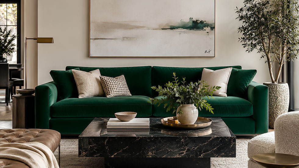
A bold sofa already has presence. Emerald green, cobalt blue, mustard, burgundy, red, or patterned upholstery can become one of the strongest elements in the room. The artwork above it should support that decision rather than compete with it. There are three useful approaches.
Let the Artwork Calm the Room
Choose artwork with softer colors, negative space, or a more restrained composition. This allows the sofa to remain the main color statement.
Repeat the Sofa Colour in Small Amounts
A painting containing just a small touch of the sofa color can make the room feel connected without looking overly coordinated.
Use Neighbouring Tones
Instead of matching the exact color, choose tones from the same family. A rust sofa may work with clay, burgundy, peach, cream, and brown. A blue sofa can sit beautifully with slate, indigo, pale blue, ivory, and warm tan. Avoid making both the sofa and artwork fight for attention. A room can have more than one statement piece, but the eye still needs somewhere to rest.
Let the Frame Connect the Artwork to the Room
Sometimes the artwork itself does not need to match anything. The frame can create the connection. A slim black frame can relate to black lighting, coffee-table legs, or architectural details. A natural wood frame can connect to timber flooring, cabinetry, or furniture. A warm metallic frame can pick up brass, bronze, or champagne-toned details in the room. This is especially useful when the artwork introduces a completely new color. For example, a colorful artwork above a charcoal sofa may initially feel separate from the room. Place it in a simple dark frame that connects to nearby furniture, and the whole composition can suddenly feel intentional. The frame should support the artwork first, but it can also help the artwork belong to the interior.
Should the Sofa Style Determine the Art Style?

It can influence it, but it should not control it. A low, clean-lined contemporary sofa can look beautiful with large abstract art, photography, or even an older landscape painting. A relaxed linen sofa may suit softer, more organic artwork — but it can also be transformed by something much bolder. A curved sculptural sofa does not automatically require curved artwork. Sometimes a strong rectangular canvas provides exactly the contrast the room needs. This is where personal taste matters. Mixing styles is often what gives an interior character. A traditional piece of furniture with contemporary art can feel fresh. A modern sofa with an aged landscape or classical-inspired piece can make the room feel more collected. The key is to make the combination look deliberate through proportion, framing, color, or material.
A Simple Designer Test Before You Hang the Artwork
Before drilling into the wall, test the relationship. You do not need special software. Take a straight-on photograph of the sofa wall in natural light. Then either hold the artwork in position, create a simple digital mock-up, or tape paper to the wall in the same dimensions. Step back and ask:
Is the artwork large enough for the sofa?
Does it sit close enough to feel connected?
Is there at least one color, material, or mood linking it to the room?
Does the sofa overpower the artwork?
Does the artwork overpower everything else?
Does the wall feel finished without feeling crowded?
Looking at a photograph can make balance easier to judge because it flattens the room. Problems with size, height, and proportion often become immediately obvious.
So, Should Wall Art Match Your Sofa?
Yes — but not by copying it. Wall art should match the sofa in the sense that the two should belong in the same interior. They do not need to share the exact color, fabric, or style. Often, the most sophisticated combinations use contrast rather than sameness. Start with scale, because size determines whether the wall feels balanced. Then look for a color thread, shared mood, material, or frame finish that connects the artwork to the wider room. If the sofa is neutral, allow the artwork to introduce character. If the sofa is bold, use the artwork to balance it, complement it, or quietly repeat part of its palette. And remember that artwork does not always need to be the final accessory added after the room is finished. Sometimes it can be the piece that gives the entire interior its direction. The best pairing feels natural at first glance and thoughtful when you look closer. That is the real designer approach: choose art that belongs with the sofa, but still has something of its own to say.
Find the Right Artwork for Your Living Room
At Nrdesign Studio, we believe an interior does not simply need decoration — it needs a focal point. Explore our wall art collections and discover large-scale canvas artwork designed to bring color, balance, and identity to contemporary interiors.


Comments